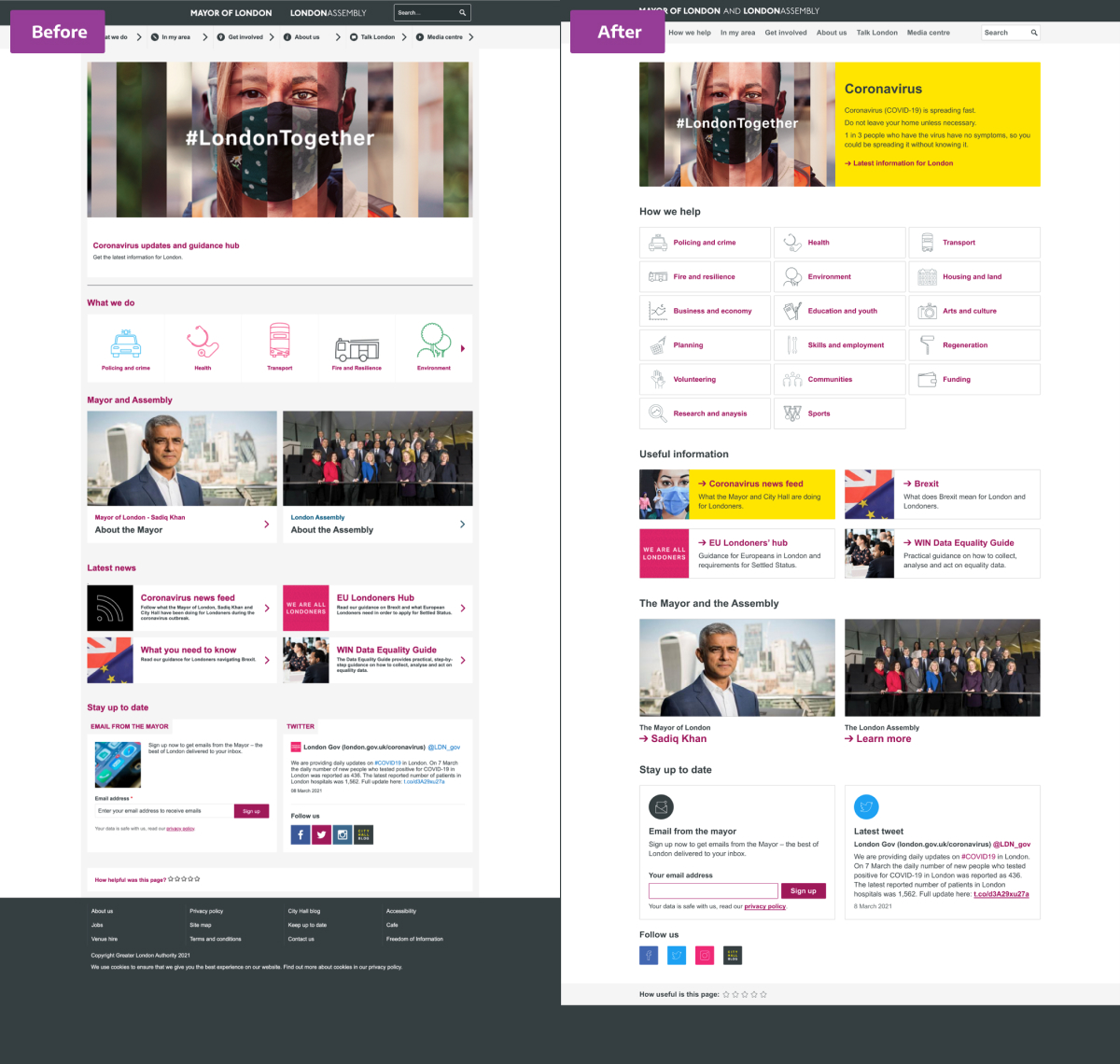
Can we make the london.gov.uk homepage easier to use?
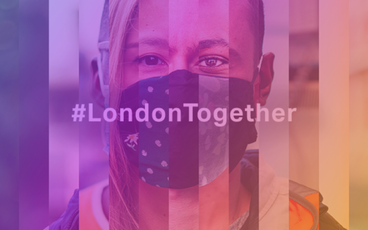
I came across the homepage for London.Gov.UK one day at work. I liked the way it tried to have a separate personality from the rest of the Gov.UK suite of pages. But there were a few things that irked me...
So, in my hubris I decided to see if I could improve it.
First impressions
It is quite well designed and fairly accessible, but I think a few tweaks could make it even more usable.
So, let us have a look at it.
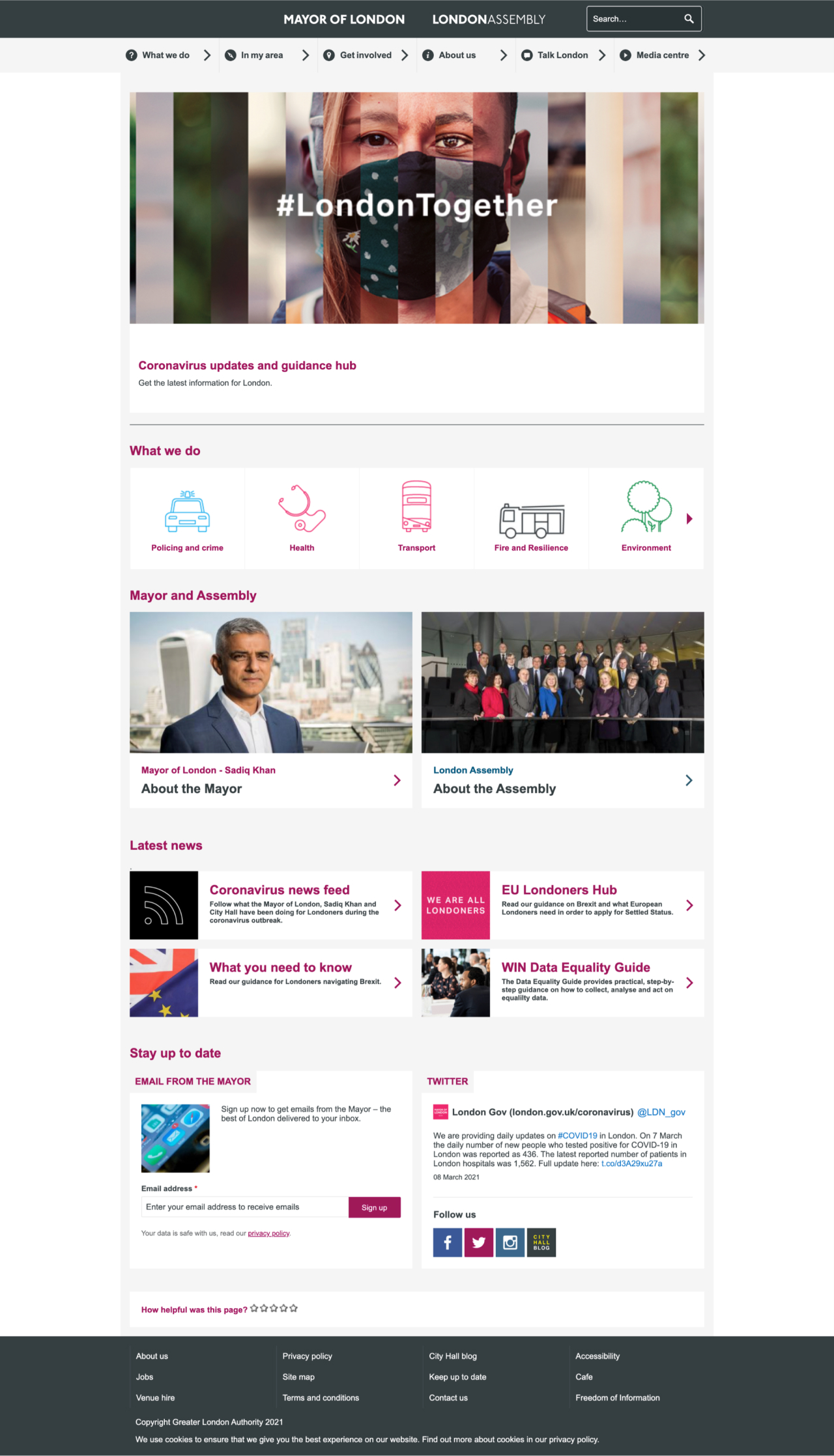
My first impression — and probably what drew me to review it in the first place — is that there are quite a few elements that are trying to be helpful, but actually hinders the understanding of the page.
These are items such as:
- the icons and the chevrons in the menu;
- the ragged alignment;
- the arbitrary divider line in the middle of the page;
- the grey page colour with white margins.
Let me start with some quick decisions:
- I will choose to use a white background. There is nothing wrong with a grey background, so this is just a personal preference. What is important is to get rid of the strange grey “T” created by the menu and the main content column.
- Secondly, should there be dividers between sections? Again, there is nothing wrong with either decision. But I have chosen to go without.
The mystery of the favicon
One of the stranger things I noticed was the favicon (the little icon displayed on the browser tab): It is a little black box with the letters CH in it. I am not sure how that relates to either the Mayor of London, the London Assembly, or the City of London itself?
Colour scheme
The page uses a sparse colour theme (apart from in the “what we do” section — but I will come to that):
- A dark grey used for both the site banner background colour and the general text colour.
- A light grey used as background colour in the global navigation and (previously) also as a background colour on the main column.
- A burgundy used for headers, links, buttons and miscellaneous items as an accent colour.
- A steel blue used only once as a link in the London Assembly card.
I will get rid of the steel blue. I do not think we need a separate link colour for the London Assembly. As we are not going to a different site with its own colour scheme, it can be be kept in a simple colour scheme for the sake of recognition.
(Update: I have noticed that the steel blue is used in other places on the website when referring to the London Assembly — and more confusingly in the media centre, which still sports a burgundy header and bread crumb trail. In my humble opinion, if “brand” colours are needed (and I would argue they are not), I would prefer them to be different to the “link” colour.)
The burgundy is a slightly bigger problem because it is used for both interactive and non-interactive elements. This is visually confusing. Especially, as links on this page are (generally) only indicated by colour. I am not trying to change the brand, so I will keep the burgundy for interactive elements — but strictly only for interactive elements.
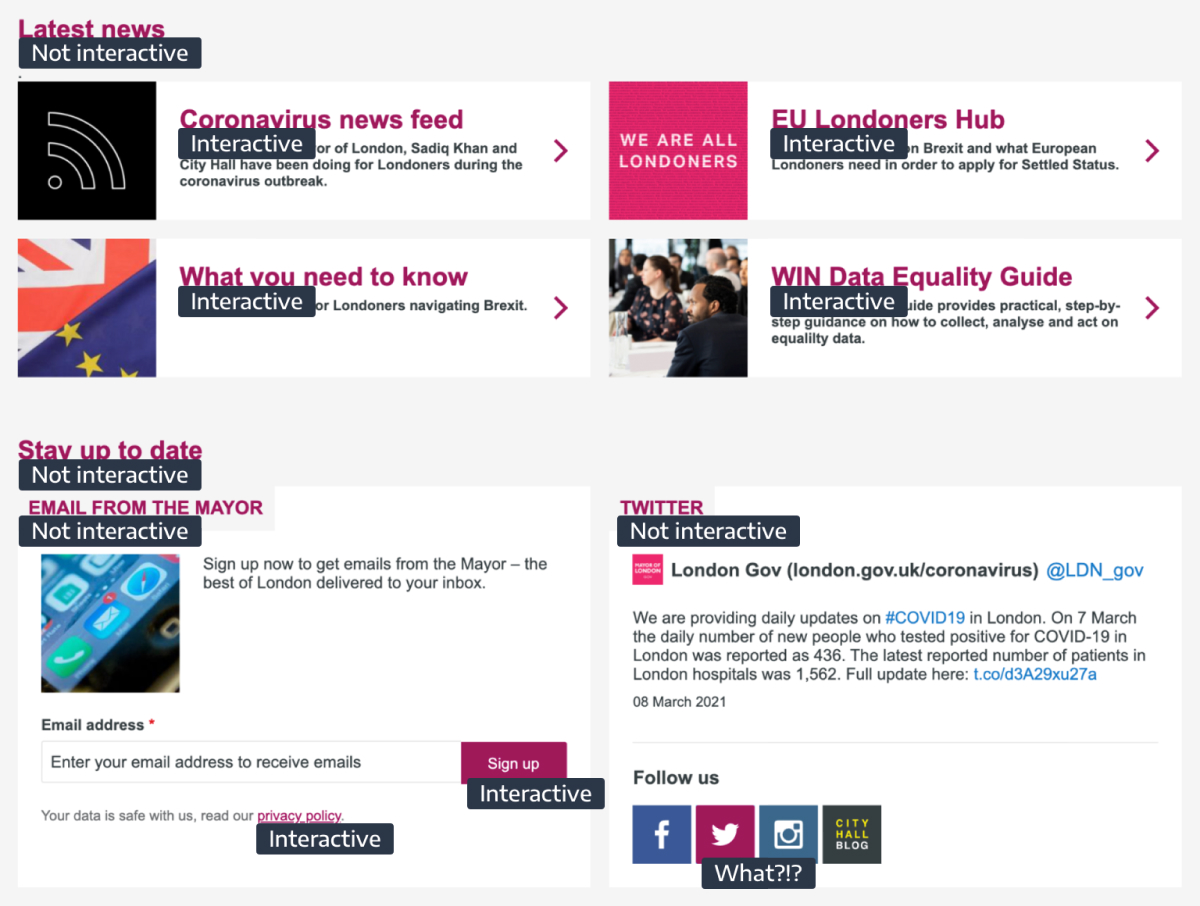
Now — with the basics in place — the rest of the page can be looked at in order.
Masthead
The masthead holding the branding has two logos that are oddly centre aligned as the only items on the page. It also holds the search box on the right, which makes the whole thing a bit lopsided.

It would be easier to read if they were on the left.
It would probably also be easier to understand if it was just one logo. We can do this with a simple “and”, an ampersand (“&”) or a slash (“/”). As it is better to err on the side of Plain English, I will opt for “and”.

Hero or villain?
Next is what I for the longest time thought was just a hero image for the site and scrolled straight past it.
But it turns out it is actually a Coronavirus banner wanting to update and inform me about the Covid situation in London.
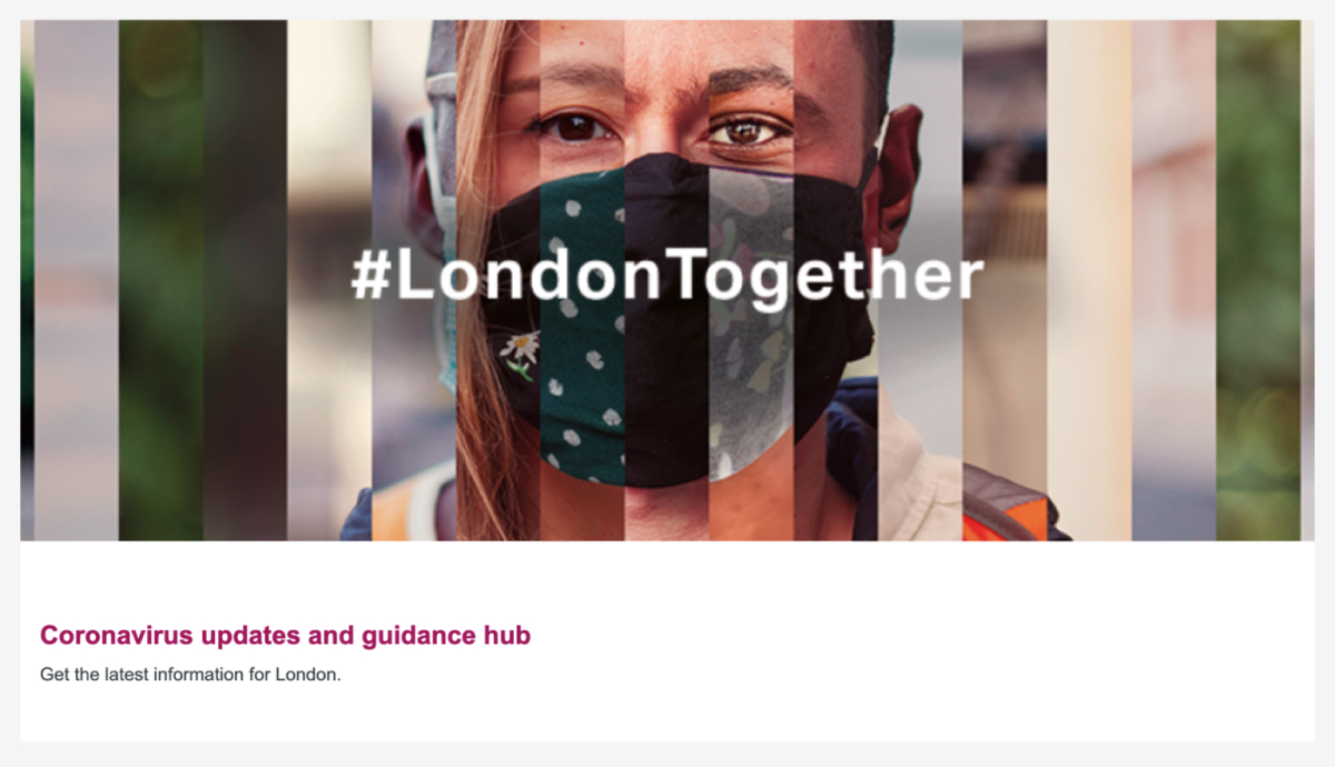
This means that it is not fixed feature (🤞) and it is actually trying to alert you to its important message.
I think it failed its purpose, because:
- It leads with a full width image that blocks out the text from view.
- It is superimposed and alt-texted with “#LondonTogether” — which doesn’t necessarily scream “Coronavirus” to me.
- The image (despite the mask) and the message both convey “togetherness” and “diversity”, rather than “Coronavirus” and “guidance”.
It can stand out by introducing a new colour that is not in the colour scheme and therefore signals that this is important and not part of the regular site. I will also move the text up, so it will get noticed. The image does not need to be full width.
And why not add the same information that is everywhere else on the gov.uk website to show an agreement on messaging? Coherent messaging is something a lot of people say is lacking (source: the pub).

What are they doing?
The “What we do” section is probably what made me open the browser inspector and play around with the page in the first place.
First of all it does not really fit in with the rest of the design: A slim, multi–coloured band in the middle of the page.

The icons are very big and using a lot of colours not used elsewhere on the site. This is probably to be helpful and aid the user find the service they want quickly. But, unfortunately, not all the icons are as easy to relate to as the first ones.
Secondly, the services have been put into a carousel, which obscures most of them.
I am not a fan of carousels for many reasons, mainly:
- They hide most of the content and you have no idea what the items are; how many there are; and if any of them are of interest to you.
- They can be hard to use for people with impaired fine motor skills.
... not to mention the coding of them, which rarely considers accessibility.
So, the first thing I tried was to put all the carousel items on to the page. This is already an improvement.
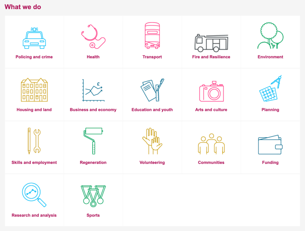
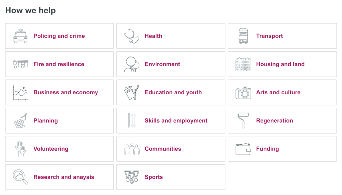
But I would like to tighten it up a bit more by putting emphasis on the text over some of the weaker icons. I can achieve this by making the icons smaller and remove the multi–coloring, which doesn't do much for finding items quicker.
Lastly, I will move the icons to the side of the text to use the space more effectively and change the title from “What we do” to the more empathic “How we help”.
Best of the rest
After this there are only small things left:
- Replace chevrons with subtler arrows for links.
- Change “Latest news” to “Useful information” as they do not seem to change often.
- Re–use the yellow colour in the Coronavirus information card to relate it to the top banner and topic.
- Move the information about the mayor and the London Assembly below the "Useful information". (This rating of importance is an assumption and should be verified by user interviews.)
- Replace the thumbnail from the “Email from the Mayor” box with an icon to declutter.
- Make Twitter blue again.
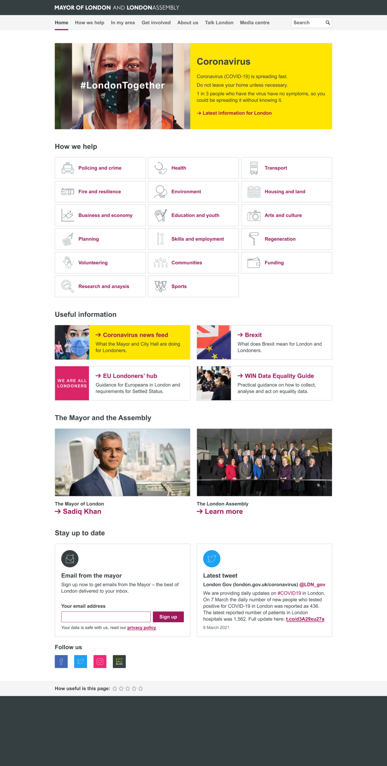
The final design
As you have made it this far through my meandering methodology then I hope you will not be disappointed by the final design...
