How can we make data easier to read?
Data is just a collection of emotionless numbers, but we can use it to tell a story. And to produce a good chart or graph we must know what story we are trying to tell.
Prologue
(This is an expansion of a discussion I had with some colleagues at work.)
In the United Kingdom there was a big controversy when the exams were cancelled in 2020 and replaced with teacher assessments and a standardisation algorithm.
The algorithm was introduced to make sure that grades stayed on the same levels as previous years. Many grades were adjusted to great dissatisfaction among both students and teachers.
The best way to understand what was going on was to create some charts and graphs.
My workplace, Tes, which is an important news source for teachers and schools worldwide (and UK in particular), also contributed with many articles on the subject and some graphs were also produced.
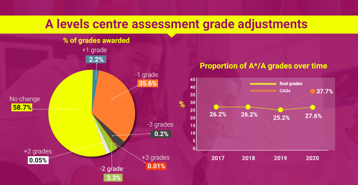
These are the graphs:
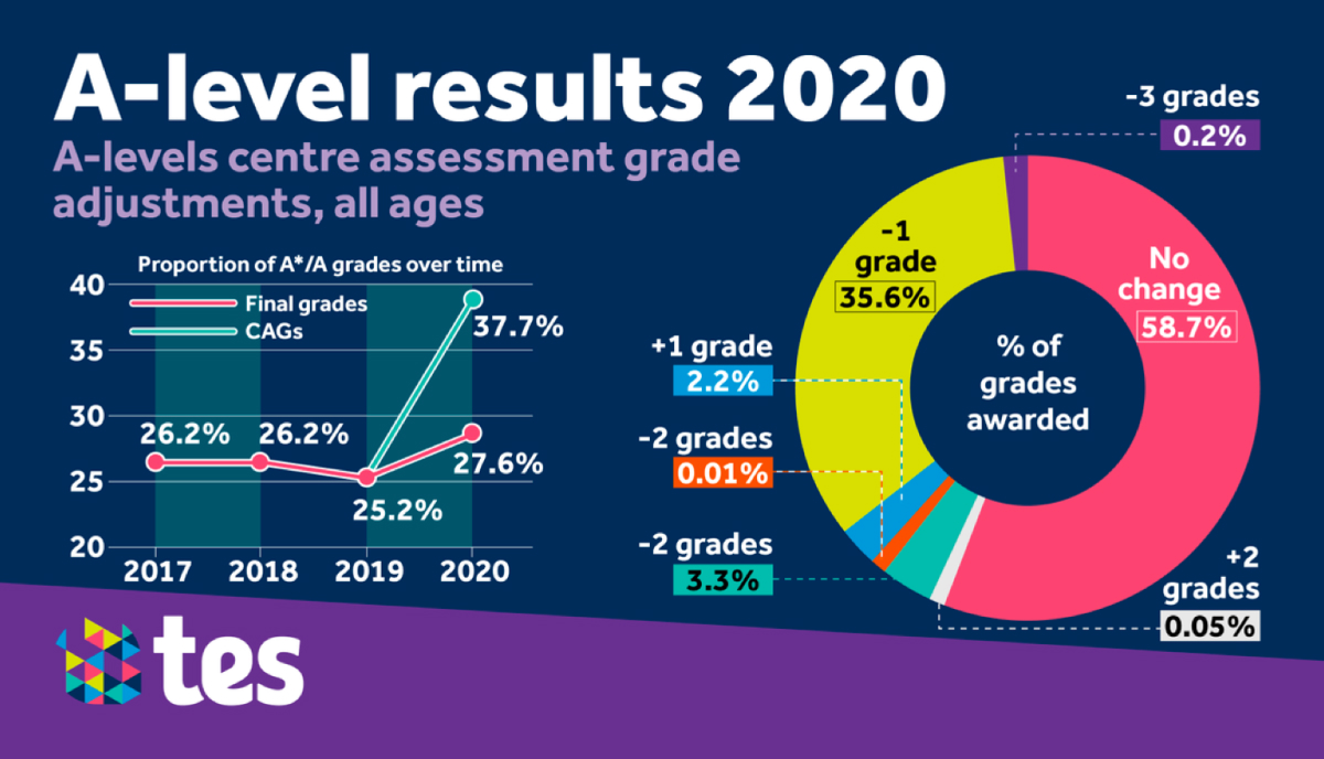
It is quite obvious that these graphs were produced on a very tight deadline because they contain errors:
- -2 grades appears twice with different values and colours;
- the term all ages make little sense in the context of A-levels, which is mainly taken at the age of 16–18.
- It takes quite a long time (cognitive load) to figure out what the charts are trying to tell. They also require upfront knowledge about the subject (for example, what CAGs are).
So, my team had a short discussion about this that ended with: So, how would you have done it?
The below was my answer:
My process
A tale of two stories
First of all, I separated the charts. The original graphic tells us that there is one story about the A-levels, but I believe there are two:
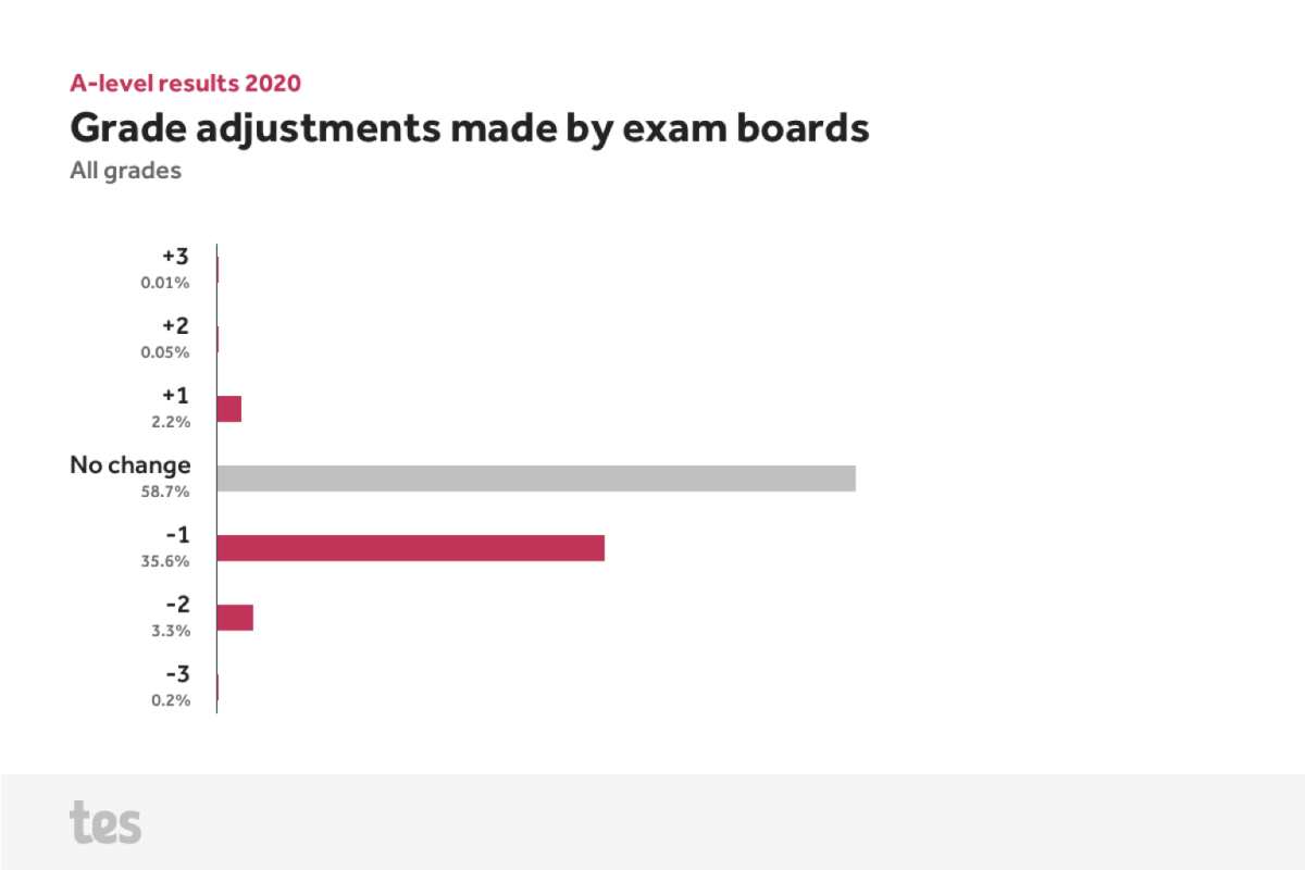
- The story of exam grade adjustments.
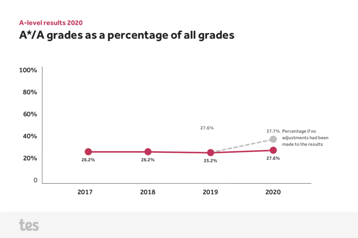
- The story of A and A✭ grades given.
I thought this would be better understood if I created separate graphics. Then I could give each graphic a succint title. A good chart title helps the reader understand what story you are trying to tell with your data.
Keep it simple
In the same way that writing in plain English makes it easier for readers to understand the writer's ideas, plain charting does the same for data.
That means showing only the minimum needed in understanding the data. Which is delightfully explained in one of my favourite quotes I use for design:
Everything should be made as simple as possible — but not simpler.
(Ascribed to) Albert Einstein
Less colour is the new black
The original graphic uses a wide colour palette together with a variety of shapes and type sizes. Most of them seems to do the job of being "on brand" rather than helping to understand the data. I reduced them to a minimum (while still using brand colours):
- one text colour;
- one amplified accent colour;
- one subtle accent colour.
The right chart for the job
The grade adjustments were originally shown as a donut chart.
Pie and donut charts are a popular solution for containing data in a limited space. But they are not always the best solution, because:
- It can be difficult to easily gauge the difference between slices.
- Labels often have to be tagged on with arrows which can be difficult to connect with the correct slice. Especially if there are multiple thin slices.
- Unless there is space between all the slices some colours can be difficult for readers to tell apart. Again: especially if there are multiple thin slices.
I thought the best chart for the job would be a good old–fashioned bar chart:
- It is easy to read and gauge the differences between the individual bars.
- The reader's eye can see the invisible distribution curve created by the graph.
20 to 40 in 60 seconds
The original graph for the A and A✭ distribution shows the level on a y-axis from 20% to 40% percent rather than a full range from 0 to 100%.
I am generally not in favour of shortening the y-axis as it can lead to mis–representation of the data or deliberately misleading graphs.
Showing the full y-axis from 0 to 100% illustrates the level of A and A✭ grades have been stable in the last four years. And even if there would have been no adjustments made to the results it would not be as wild a fluctuation as the original graph (with its abbreviated y-axis) led to believe.
(Update: The Tes chart was replaced with OfQual’s original chart of the same (and the source of the chart above) and is no longer available on tes.com.)
Further reading
Header image by Dawid Małecki