How can we make the applicant tracking system user friendly?

TODO! WRITE SOMETHING!!!!!
Context
Tes is an EdTech company that has supported teachers and teaching for more than 100 years. They mediate Jobs, peer-to-peer teaching resources, education news, and more.
Challenge
The Tes Applicant Tracking System (ATS) is a collection of features built at different times and by different teams. This has made it difficult to use and put pressure on the customer services departments.
Our job is to update it and make it easier to use.
My role
I am the sole designer working with the Product Owner for recruitment.
Process
Discovery phase
We started by carrying out a review of the user journey and pages.

It was clear that the journeys were quite convoluted. Features could be hard to find if the user was not familiar with them or not had training in how to use the application.
We started with some informal talks with schools to better understand their recruitment process and pain points. It was a mixture of schools, some of which were using our ATS, some using a competitor ATS, and some not using an ATS at all.
We also gathered information from our own account owners and customer service representatives.
We discovered the following pain points:
- Recruitment in (UK) schools happens at specific times of the year. These periods are intense for the people posting jobs, assessing applications, and interviewing candidates.
- Not everyone uses computers. A lot of school recruiters will print out the applications and review them. Then inform the admins of their decisions.
- Overview is key. Being able to see what is new or has changed at a glance is important.
- HR admins can change often. It can cost a lot of training and support time if we don't have a simple, intuitive system.
- Comments are important. Quick access to adding and reading other reviewers' comments is key.
Prototype
I created a very basic prototype based on our assumptions. We started collecting feedback from the same and new schools.
We then gradually improve the prototype from the feedback we receive. And then present it back again.

We also present it to the engineering squad on a regular basis. They are excellent at suggesting improvements and catch out technical challenges. And, this way, they are also aware of upcoming work.
Main outcomes
Simplifying the navigation
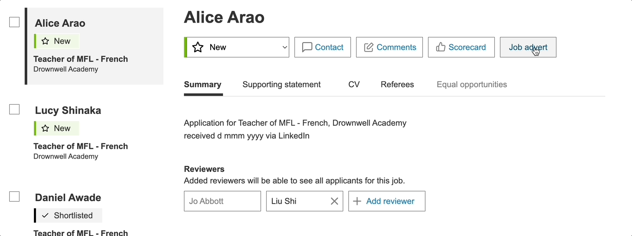
As the name implies, an Applicant Tracking System is all about the applicants. So, it is important that you can find the relevant applicant(s) quickly.
We simplified the navigation so users find candidates directly or through the job they applied for. We support this with a solid selection of filters that are intuitive to the users.


The pipeline
It was important for the recruitment admins to have a quick overview of the jobs and their status. We realised that one of the best ways of doing this was by surfacing the pipeline. The pipeline is the funnel of applicants from application to hire.
It became quite clear that the best representation was numbers. Many admins have a mental map of acceptable candidate numbers for various jobs and subjects. And also triggers for when they need to extend the job adverts.


Email-like behaviour
We decided to lean on technology that our users were already familiar with to display candidates: email. This also leverages one of my favourite laws of UX: My namesake, Jakob’s Law:
Users spend most of their time on other sites. This means that users prefer your site to work the same way as all the other sites they already know.
Jakob Nielsen
In testing, it was nice to see that they immediately understood the concept without any hints. Some of them even said during testing: It's just like email.
Even the checkboxes on the side were immediately understood to be for bulk actions even though they hadn't been wired up yet.

Comments
Comments are critical to deciding whether to advance a candidate or not. Seeing other people's comments and what they comment on is important. Again, teachers are used to editing online documents and often brought this up. We decided to allow users to add comments anywhere and to see those comments in the place they were created.

Everything at your fingertips
It wasn't only the comments that users would like to have within easy reach. Being able to quickly refer to the job advert is useful. Also, scoring the candidate or progressing them in the pipeline is useful to have close by.
We implemented a slide-in panel, so users could compare without leaving the page.
Future considerations
- Anonymous (blind) recruitment is becoming more important in schools. We will need to find a way of doing this that works for the different ways schools have implemented this.
- Get a full understanding of all the different ways schools report on equal opportunities (protected characteristics). This takes schools a lot of time and they would like our help to make it easier.
- Allowing users to search and contact our database of users who have opted in.
- At the moment we do not own the posting of a new job. This limits some of the functionality we would like to move or create. Such as adding reviewers, creating custom pipelines for different types of jobs, and creating the candidate scorecard upfront.
Prototype
The latest Axure prototype is available online: https://hfzy7u.axshare.com/
Header image by Eric Prouzet